Building beautiful components faster with Storybook 9 and Expo

- Published on
This is a guest blog post from Daniel Williams - a frontend developer and open-source maintainer with over 10 years of experience in React and React Native.
...
Picture this: You’re building a complex screen deep in your React Native app with a variety of success and error states. Whenever one of your changes triggers a full reload, you need to login to your app and get back to the state you were working on.
The first few times this happens, you shrug it off. But this workflow gets tiresome really fast!
What if, instead, you had a catalog of each of your UI states? You could not only navigate directly to that screen to pick up where you left off before the change, but you could also share those screens with your teammates for easy review. You could even turn those UI states into automated tests that run quickly in CI without all the flake of an end-to-end test.
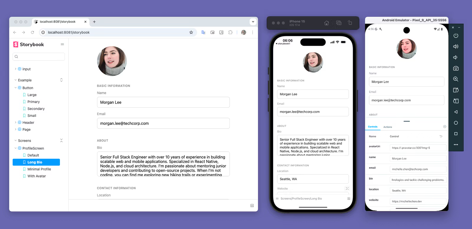
The workflow I’m describing here is exactly what Storybook for React Native is for. In this post, I’ll guide you how to get it set up in your Expo app so you can get the most out of it. The post is based on the recently released Storybook 9, which offers the best React Native support yet.
Setup Storybook 9 in an Expo app
For those new to Storybook, it's a development environment that lets you build, test, and document UI components in isolation. Think of it as a workshop where you can craft each component independently, without the complexity of your full application. This component-first workflow enables visual testing, serves as living documentation, and helps teams maintain design consistency across large codebases.
Before we begin, make sure you have:
- An existing Expo app using Expo Router (SDK 50 or later recommended)
- Or create a new one to follow along with npx create-expo-app
- if you make a new expo app, run npm run reset-project to get a clean project
- Node.js 20+ and your preferred package manager (bun, npm, yarn, or pnpm)
- A device or simulator for testing
If you want to check the finished version of the storybook in this guide you can find the example repo here.
Installing Storybook The easiest way to add Storybook to your existing Expo Router project is the create command
npm create storybook@latest
When prompted, choose recommended and then React Native. This creates a .rnstorybook configuration folder and installs the necessary dependencies, including @storybook/react-native.
Configure Metro bundler We'll need some Metro configuration to work with Storybook. First, customize your Metro config:
npx expo@latest customize metro.config.js
Then update your metro.config.js to include Storybook support:
// Learn more https://docs.expo.io/guides/customizing-metro
const { getDefaultConfig } = require("expo/metro-config");

/** @type {import('expo/metro-config').MetroConfig} */
const config = getDefaultConfig(__dirname);

const withStorybook = require("@storybook/react-native/metro/withStorybook");
/** withStorybook Adds the config that storybook uses */
module.exports = withStorybook(config);
Create a Storybook route In Expo Router, create a new route for Storybook by adding app/storybook.tsx:
export { default } from '../.rnstorybook';
This creates a /storybook route that you can navigate to within your app.
Configure your storybook route to hide the header and make storybook only accessible in dev (or based on your own logic). To do this edit your layout file app/_layout.tsx like so:
// app/_layout.tsx
import { Stack } from "expo-router";

export default function RootLayout() {
  return (
    <Stack screenOptions={{ headerShown: false }}>
      <Stack.Screen name="index" />
      <Stack.Protected guard={__DEV__}>
        <Stack.Screen name="storybook" />
      </Stack.Protected>
    </Stack>
  );
}
Using Stack.Protected here makes it so the screen will only be accessible in dev, you can expand on this by using an environment variable or other logic to change how this works.
Running Storybook The only thing left to do is run your app.
npm run start
Now to access storybook by add a link to the /storybook route in your app. For now lets add it in the index app/index.tsx .
import { Link } from "expo-router";
import { View } from "react-native";

export default function Index() {
  return (
    <View
      style={{
        flex: 1,
        justifyContent: "center",
        alignItems: "center",
      }}
    >
      <Link href="/storybook">Open Storybook</Link>
    </View>
  );
}
When you open the storybook screen you should see something like this:
Write stories for your components In Storybook a story is an example of your components in a specific UI state. For example I can make Loading and Disabled stories that shoes my button in each in those states.
Lets build out an input component to show off the different Storybook features.
In a moment we’ll create a components folder for our new components and stories. In order for storybook to pick up stories in that folder we need to add the components directory to our stories regex in .rnstorybook/main.ts:
// .rnstorybook/main.ts
import { StorybookConfig } from "@storybook/react-native";

const main: StorybookConfig = {
  stories: [
    "./stories/**/*.stories.?(ts|tsx|js|jsx)",
    // the paths are relative to the main.ts file itself
    "../components/**/*.stories.?(ts|tsx|js|jsx)", // <--- Add this
  ],
  addons: [
    "@storybook/addon-ondevice-controls",
    "@storybook/addon-ondevice-actions",
  ],
};

export default main;
🚨 Important Note: Make sure to restart metro after making changes to your stories regex. This will trigger generation of the storybook.requires.ts file which enables Storybook to watch the new directories you included.
Lets create a simple input component with a few states. Add a input.tsx file in the components directory (create the directory if you haven’t already):
// components/input.tsx
import { useState } from "react";
import { Text, TextInput, View, type TextInputProps } from "react-native";

type InputProps = TextInputProps & {
  label?: string;
  error?: string;
  disabled?: boolean;
};

const getBorderColor = (isFocused: boolean, error?: string) => {
  if (error) {
    return "#FF3B30";
  }

  return isFocused ? "#007AFF" : "#D1D1D6";
};

export const Input = ({ disabled, label, error, ...props }: InputProps) => {
  const [isFocused, setIsFocused] = useState(false);

  const borderColor = getBorderColor(isFocused, error);

  return (
    <View style={{ gap: 4 }}>
      <Text id="input-label" style={{ fontSize: 14, color: "#3C3C43" }}>
        {label}
      </Text>

      <TextInput
        aria-labelledby="input-label"
        aria-disabled={disabled}
        style={{
          borderWidth: 1,
          padding: 12,
          borderRadius: 8,
          borderColor,
          backgroundColor: disabled ? "#F5F5F5" : "transparent",
        }}
        editable={!disabled}
        onFocus={() => {
          setIsFocused(true);
        }}
        onBlur={() => {
          setIsFocused(false);
        }}
        {...props}
      />

      {error && <Text style={{ fontSize: 12, color: "#FF3B30" }}>{error}</Text>}
    </View>
  );
};
Add a input.stories.tsx file in the components directory like this:
// components/input.stories.tsx
import { Meta, StoryObj } from "@storybook/react-native";
import { Input } from "./input";

const meta = {
  component: Input,
} satisfies Meta<typeof Input>;

export default meta;

type Story = StoryObj<typeof meta>;

export const Basic: Story = {
  args: {
    label: "First Name",
    placeholder: "John",
  },
};
Now you’ve got your basic story and you’ll see the input in your storybook with the “First Name” label and “John” placeholder.
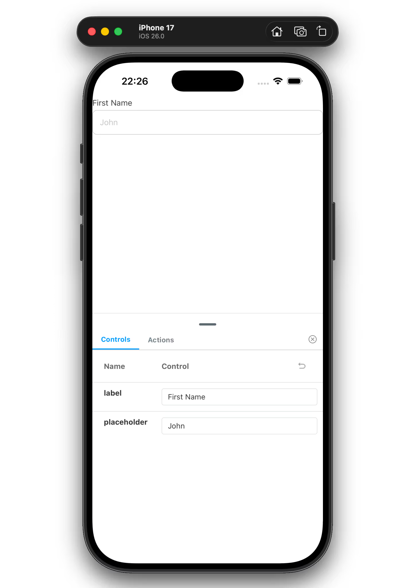
The args of a story set the default props passed to the component when the story renders, you can then adjust the state in realtime using the controls panel.
Now we can add a few more states to our stories file by adding the Error and Disabled stories like so:
// components/input.stories.tsx
// ... rest of the story file 👆

export const Error: Story = {
  args: {
    label: "Email",
    error: "Email is required",
    disabled: false,
    placeholder: "example@example.com",
  },
};

export const Disabled: Story = {
  args: {
    label: "Disabled",
    error: "",
    disabled: true,
    placeholder: "Disabled",
  },
};
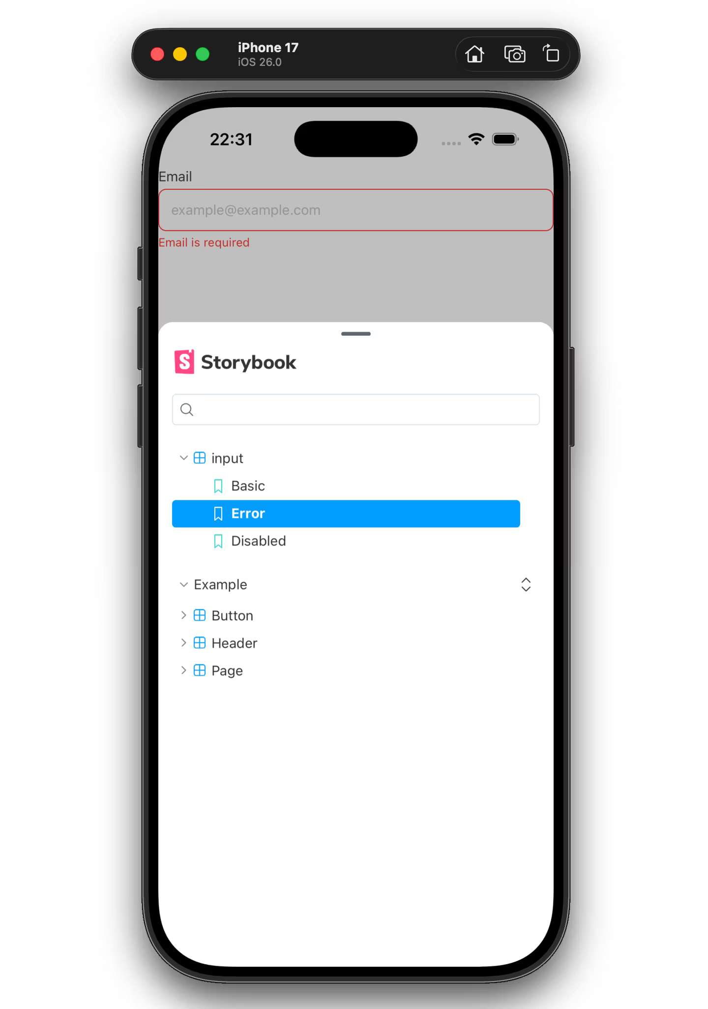
Now you’ll see some new states show up in the menu and you can quickly go between them.
import { View } from "react-native"; // add this

// components/input.stories.tsx
const meta = {
  component: Input,
  decorators: [
    // Here we're adding a container with 16px padding.
    // add this 👇
    (Story) => (
      <View style={{ padding: 16 }}>
        <Story />
      </View>
    ),
  ],
} satisfies Meta<typeof Input>;

// Rest of your stories file here...
You might notice that our input component is flush with the sides of the ui and it might be nicer if we could add some kind of wrapper to add padding around it. This is exactly the kind of thing decorators can be used for.
Lets edit the meta for our stories file to add a decorator:
import { View } from "react-native"; // add this

// components/input.stories.tsx
const meta = {
  component: Input,
  decorators: [
    // Here we're adding a container with 16px padding.
    // add this 👇
    (Story) => (
      <View style={{ padding: 16 }}>
        <Story />
      </View>
    ),
  ],
} satisfies Meta<typeof Input>;

// Rest of your stories file here...
You should now see that there’s a bit more space around our component.
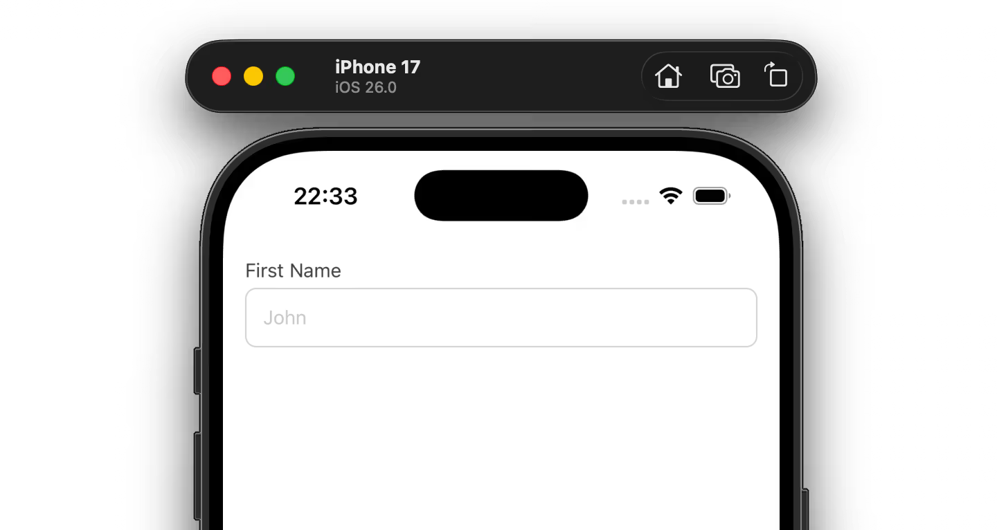
You can also use decorators for things like theme, mocking, or application state providers. You can also add decorators on the Story level for individual stories or globally in .rnstorybook/preview.tsx .
const meta = {
  component: Input,
  decorators: [
    // You can wrap your stories here with anything you like
    // Here I added an example ThemeProvider that could come from a UI library
    (Story) => (
	  <ThemeProvider>
          <View style={{ padding: 16 }}>
			   <Story/>
          </View>
	  </ThemeProvider>
    ),
  ],
} satisfies Meta<typeof Input>;
For more on writing stories please see the official docs here.